Ch. 25: Many models
Key questions:
- 25.2.5 #1, 2
nestcreates a list-column with default key valuedata. Each row value becomes a dataframe with all non-grouping columns and all rows corresponding with a particular group
iris %>%
  group_by(Species) %>%
nest()unnestunnest any list-column in your dataframe.
Notes on unnest behavior:
- if the atomic components of the elements of the list column are length > 1, the non-nested row columns will be duplicated when the list-column is unnested
# atomic components of elements of list-col == 3 --> (will see duplicates of `x`)
tibble(x = 1:100) %>%
  mutate(test1 = list(tibble(a = c(1, 2, 3)))) %>%
  unnest(test1)

# atomic components of elements of list-col == 1 --> (will not see duplicates of `x`)
tibble(x = 1:100) %>%
  mutate(test1 = list(tibble(a = 1, b = 2))) %>%
unnest(test1) - if there are multiple list-cols, specify the column to unnest or default behavior will be to unnest all
- when unnesting a single column but multiple list-cols exist, the default behavior is to drop the other list columns. To override this use
.drop = FALSE.45
tibble(x = 1:100) %>%
  mutate(test1 = list(c(1, 2)),
         test2 = list(c(3, 4))) %>%
unnest(test1, .drop = FALSE) # change to default, i.e. `.drop = TRUE` to drop `test2` column- when unnesting multiple columns, all must be the same length or you will get an error, e.g. below fails:
tibble(x = 1:100) %>%
  mutate(test1 = list(c(1)),
         test2 = list(c(2,3))) %>%
  unnest()
## Error: All nested columns must have the same number of elements.# # to successfully unnest this could have added another unnest, e.g.:
# tibble(x = 1:100) %>%
# mutate(test1 = list(c(1)),
# test2 = list(c(2,3))) %>%
# unnest(test1) %>%
# unnest(test2)- Method for nesting individual vectors:
group_by() %>% summarise(), e.g.:
iris %>%
  group_by(Species) %>%
  summarise_all(list)
## # A tibble: 3 x 5
## Species Sepal.Length Sepal.Width Petal.Length Petal.Width
## <fct> <list> <list> <list> <list>
## 1 setosa <dbl [50]> <dbl [50]> <dbl [50]> <dbl [50]>
## 2 versicolor <dbl [50]> <dbl [50]> <dbl [50]> <dbl [50]>
## 3 virginica <dbl [50]> <dbl [50]> <dbl [50]> <dbl [50]>- the above has the advantage of producing atomic vectors rather than dataframes as the types inside of the lists
broom::glancetakes a model as input and outputs a one row tibble with columns for each of several model evalation statistics (note that these metrics are geared towards evaluating the training)broom::tidycreates a tibble with columnsterm,estimate,std.error,statistic(t-statistic) andp.value. A new row is created for eachtermtype, e.g. intercept, x1, x2, etc.ggtitle(), alternative tolabs(title = "type title here")- see 25.4.5 number 3 for a useful way of wrapping certain functions in
listfunctions to take advantage of the list-col format
25.2: gapminder
The set-up example Hadley goes through is important, below is a slightly altered copy of his example.
Nested Data
by_country <- gapminder::gapminder %>%
  group_by(country, continent) %>%
  nest()
List-columns
country_model <- function(df) {
  lm(lifeExp ~ year, data = df)
}
Want to apply this function over every data frame, the dataframes are in a list, so do this by:
by_country2 <- by_country %>%
  mutate(model = purrr::map(data, country_model))
Advantage with keeping things in the dataframe is that when you filter, or move things around, everything stays in sync, as do new summary values you might add.
by_country2 %>%
  arrange(continent, country)
## # A tibble: 142 x 4
## country continent data model
## <fct> <fct> <list> <list>
## 1 Algeria Africa <tibble [12 x 4]> <S3: lm>
## 2 Angola Africa <tibble [12 x 4]> <S3: lm>
## 3 Benin Africa <tibble [12 x 4]> <S3: lm>
## 4 Botswana Africa <tibble [12 x 4]> <S3: lm>
## 5 Burkina Faso Africa <tibble [12 x 4]> <S3: lm>
## 6 Burundi Africa <tibble [12 x 4]> <S3: lm>
## 7 Cameroon Africa <tibble [12 x 4]> <S3: lm>
## 8 Central African Republic Africa <tibble [12 x 4]> <S3: lm>
## 9 Chad Africa <tibble [12 x 4]> <S3: lm>
## 10 Comoros Africa <tibble [12 x 4]> <S3: lm>
## # ... with 132 more rowsby_country2 %>%
mutate(summaries = purrr::map(model, summary)) %>%
mutate(r_squared = purrr::map2_dbl(model, data, rsquare))## # A tibble: 142 x 6
## country continent data model summaries r_squared
## <fct> <fct> <list> <list> <list> <dbl>
## 1 Afghanistan Asia <tibble [12 x 4~ <S3: l~ <S3: summary.l~ 0.948
## 2 Albania Europe <tibble [12 x 4~ <S3: l~ <S3: summary.l~ 0.911
## 3 Algeria Africa <tibble [12 x 4~ <S3: l~ <S3: summary.l~ 0.985
## 4 Angola Africa <tibble [12 x 4~ <S3: l~ <S3: summary.l~ 0.888
## 5 Argentina Americas <tibble [12 x 4~ <S3: l~ <S3: summary.l~ 0.996
## 6 Australia Oceania <tibble [12 x 4~ <S3: l~ <S3: summary.l~ 0.980
## 7 Austria Europe <tibble [12 x 4~ <S3: l~ <S3: summary.l~ 0.992
## 8 Bahrain Asia <tibble [12 x 4~ <S3: l~ <S3: summary.l~ 0.967
## 9 Bangladesh Asia <tibble [12 x 4~ <S3: l~ <S3: summary.l~ 0.989
## 10 Belgium Europe <tibble [12 x 4~ <S3: l~ <S3: summary.l~ 0.995
## # ... with 132 more rowsunnesting, another dataframe with the residuals included and then unnest
by_country3 <- by_country2 %>%
  mutate(resids = purrr::map2(data, model, add_residuals))
resids <- by_country3 %>%
unnest(resids)
resids## # A tibble: 1,704 x 7
## country continent year lifeExp pop gdpPercap resid
## <fct> <fct> <int> <dbl> <int> <dbl> <dbl>
## 1 Afghanistan Asia 1952 28.8 8425333 779. -1.11
## 2 Afghanistan Asia 1957 30.3 9240934 821. -0.952
## 3 Afghanistan Asia 1962 32.0 10267083 853. -0.664
## 4 Afghanistan Asia 1967 34.0 11537966 836. -0.0172
## 5 Afghanistan Asia 1972 36.1 13079460 740. 0.674
## 6 Afghanistan Asia 1977 38.4 14880372 786. 1.65
## 7 Afghanistan Asia 1982 39.9 12881816 978. 1.69
## 8 Afghanistan Asia 1987 40.8 13867957 852. 1.28
## 9 Afghanistan Asia 1992 41.7 16317921 649. 0.754
## 10 Afghanistan Asia 1997 41.8 22227415 635. -0.534
## # ... with 1,694 more rows25.2.5
A linear trend seems to be slightly too simple for the overall trend. Can you do better with a quadratic polynomial? How can you interpret the coefficients of the quadratic? (Hint you might want to transform
yearso that it has mean zero.)Create functions
# funciton to center value
center_value <- function(df){
  df %>%
    mutate(year_cent = year - mean(year))
}

# this function allows me to input any text to "var" to customize the inputs
# to the model, default are a linear and quadratic term for year (centered)
lm_quad_2 <- function(df, var = "year_cent + I(year_cent^2)"){
  lm(as.formula(paste("lifeExp ~ ", var)), data = df)
}
Create dataframe with evaluation metrics
by_country3_quad <- by_country3 %>%
  mutate(
    # create centered data
    data_cent = purrr::map(data, center_value),
    # create quadratic models
    mod_quad = purrr::map(data_cent, lm_quad_2),
    # get model evaluation stats from original model
    glance_mod = purrr::map(model, broom::glance),
    # get model evaluation stats from quadratic model
    glance_quad = purrr::map(mod_quad, broom::glance))
Create plots
by_country3_quad %>%
  unnest(glance_mod, glance_quad, .sep = "_", .drop = TRUE) %>%
  gather(glance_mod_r.squared, glance_quad_r.squared,
         key = "order", value = "r.squared") %>%
  ggplot(aes(x = continent, y = r.squared, colour = continent)) +
  geom_boxplot() +
  facet_wrap(~order)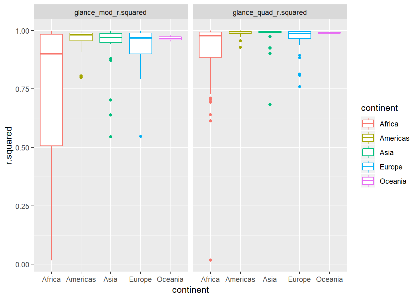
- The quadratic trend seems to do better –> indicated by the distribution of the R^2 values being closer to one. The level of improvement seems especially pronounced for African countries.
Let’s check this closer by looking at percentage point improvement in R^2 in chart below
by_country3_quad %>%
  mutate(quad_coefs = map(mod_quad, broom::tidy)) %>%
  unnest(glance_mod, .sep = "_") %>%
  unnest(glance_quad) %>%
  mutate(bad_fit = glance_mod_r.squared < 0.25,
         R.squ_ppt_increase = r.squared - glance_mod_r.squared) %>%
  ggplot(aes(x = continent, y = R.squ_ppt_increase))+
  # geom_quasirandom(aes(alpha = bad_fit), colour = "black")+
  geom_boxplot(alpha = 0.1, colour = "dark grey")+
  geom_quasirandom(aes(colour = continent))+
  labs(title = "Percentage point (PPT) improvement in R squared value",
       subtitle = "(When adding a quadratic term to the linear regression model)")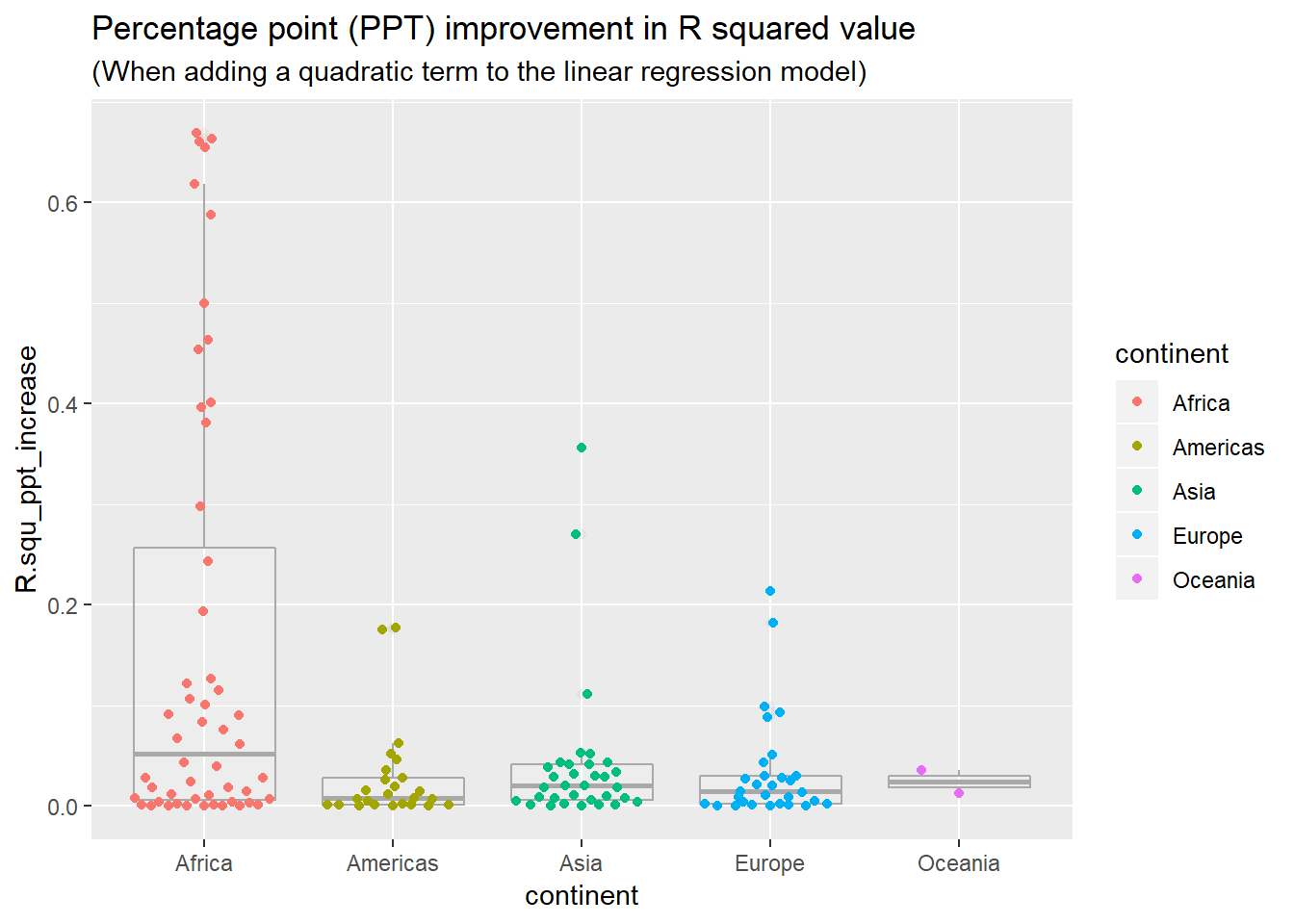
View predictions from linear model with quadratic term (of countries where linear trend did not capture relationship)
bad_fit <- by_country3 %>%
  mutate(glance = purrr::map(model, broom::glance)) %>%
  unnest(glance, .drop = TRUE) %>%
  filter(r.squared < 0.25)

#solve with join with bad_fit
by_country3_quad %>%
  semi_join(bad_fit, by = "country") %>%
  mutate(data_preds = purrr::map2(data_cent, mod_quad, add_predictions)) %>%
  unnest(data_preds) %>%
  ggplot(aes(x = year, group = country))+
  geom_point(aes(y = lifeExp, colour = country))+
  geom_line(aes(y = pred, colour = country))+
  facet_wrap(~country)+
  theme(axis.text.x = element_text(angle = 90, hjust = 1))
- while the quadratic model does a better job fitting the model than a linear term does, I wouldn’t say it does a good job of fitting the model
- it looks like the trends are generally consistent rates of improvement and then there is a sudden drop-off associated with some event, hence an intervention variable may be a more appropriate method for modeling this pattern
Quadratic model parameters
by_country3_quad %>%
  mutate(quad_coefs = map(mod_quad, broom::tidy)) %>%
  unnest(glance_mod, .sep = "_") %>%
  unnest(glance_quad) %>%
  unnest(quad_coefs) %>%
  mutate(bad_fit = glance_mod_r.squared < 0.25) %>%
  ggplot(aes(x = continent, y = estimate, alpha = bad_fit))+
  geom_boxplot(alpha = 0.1, colour = "dark grey")+
  geom_quasirandom(aes(colour = continent))+
  facet_wrap(~term, scales = "free")+
  labs(caption = "Note that 'bad fit' represents a bad fit on the initial model \nthat did not contain a quadratic term)")+
  theme(axis.text.x = element_text(angle = 90, hjust = 1))
## Warning: Using alpha for a discrete variable is not advised.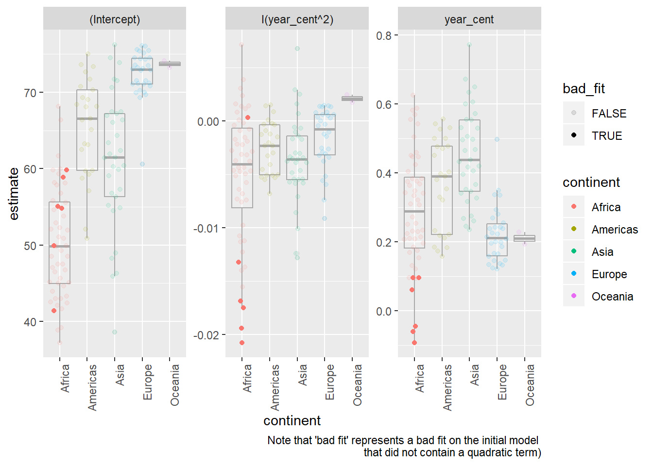
- The quadratic term (in a linear function, trained with the x-value centered at the mean, as in this dataset) has a few important notes related to interpretation
- If the coefficient is positive the output will be convex, if it is negative it will be concave (i.e. smile vs. frown shape)
- The value on the coefficient represents 1/2 the rate at which the relationship between
lifeExpandyearis changing for every one unit change from the mean / expected value oflifeExpin the dataset. - Hence if the coefficient is near 0, that means the relationship between
lifeExpandyeardoes not change (or at least does not change at a constant rate) when moving in either direction fromlifeExps mean value.
To better understand this, let’s look look at a specific example. Excluding Rwanda, Botswana was the
countrythat the linear model without the quadratic term performed the worst on. We’ll use this as our example for interpreting the coefficients.Plots of predicted and actual values for Botswanian life expectancy by year
by_country3_quad %>%
  filter(country == "Botswana") %>%
  mutate(data_preds = purrr::map2(data_cent, mod_quad, add_predictions)) %>%
  unnest(data_preds) %>%
  ggplot(aes(x = year, group = country))+
  geom_point(aes(y = lifeExp))+
  geom_line(aes(y = pred, colour = "prediction"))+
labs(title = "Data and quadratic trend of predictions for Botswana")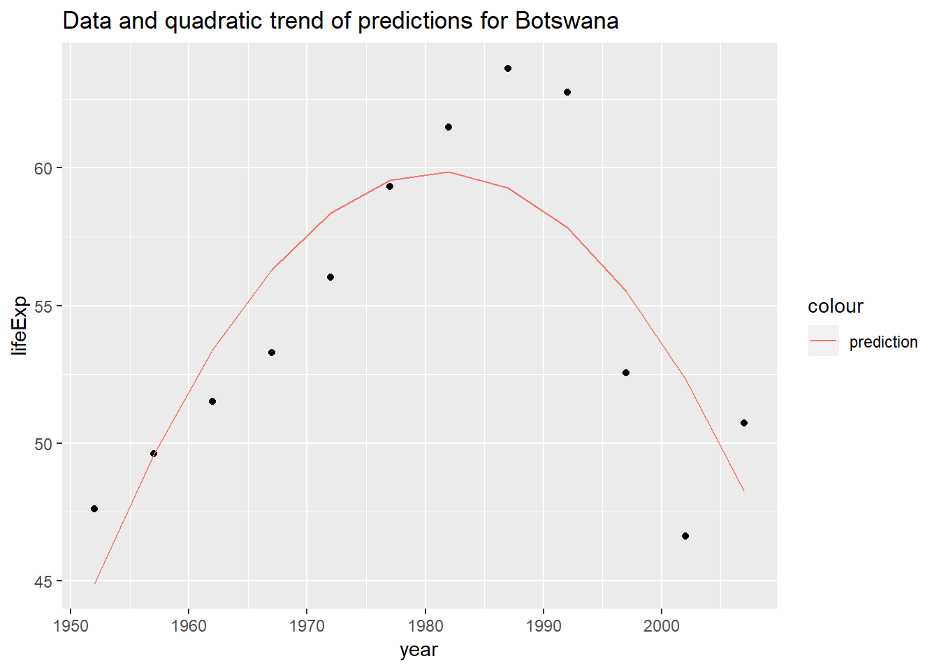
(note that the centered value for year in the ‘centered’ dataset is 1979.5)
In the model for Botswana, coefficents are:
Intercept: ~ 59.81
year (centered): ~ 0.0607
year (centered)^2: ~ -0.0175Hence for every one year we move away from the central year (1979.5), the rate of change between year and price decreases by ~0.035.
Below I show this graphically by plotting the lines tangent to the models output.
botswana_coefs <- by_country3_quad %>%
  filter(country == "Botswana") %>%
  with(map(mod_quad, coef)) %>%
  flatten_dbl()
Helper functions to find tangent points
find_slope <- function(x){
  2*botswana_coefs[[3]]*x + botswana_coefs[[2]]
}

find_y1 <- function(x){
  botswana_coefs[[3]]*(x^2) + botswana_coefs[[2]]*x + botswana_coefs[[1]]
}

find_intercept <- function(x, y, m){
  y - x*m
}

tangent_lines <- tibble(x1 = seq(-20, 20, 10)) %>%
  mutate(slope = find_slope(x1),
         y1 = find_y1(x1),
         intercept = find_intercept(x1, y1, slope),
         slope_change = x1*2*botswana_coefs[[3]]) %>%
  select(slope, intercept, everything())
by_country3_quad %>% filter(country == "Botswana") %>% mutate(data_preds = purrr::map2(data_cent, mod_quad, add_predictions)) %>% unnest(data_preds) %>% ggplot(aes(x = year_cent))+ geom_line(aes(x = year_cent, y = pred), colour = "red")+ geom_abline(aes(intercept = intercept, slope = slope), data = tangent_lines)+ coord_fixed()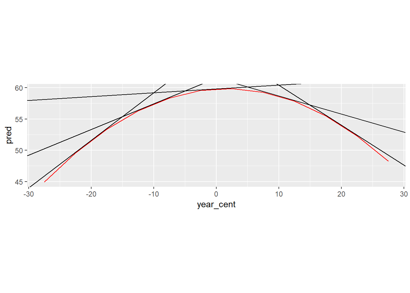
Below is the relevant output in a table.
x1: represents the change in x value from 1979.5
slope: slope of the tangent line at particularx1value
slope_diff_central: the amount the slope is different from the slope of the tangent line at the central yearselect(tangent_lines, x1, slope, slope_diff_central = slope_change)## # A tibble: 5 x 3 ## x1 slope slope_diff_central ## <dbl> <dbl> <dbl> ## 1 -20 0.760 0.700 ## 2 -10 0.411 0.350 ## 3 0 0.0607 0 ## 4 10 -0.289 -0.350 ## 5 20 -0.639 -0.700- notice that for every 10 year increase in
x1we see the slope of the tangent line has decreased by 0.35. If we’d looked at just one year we would have seen the change was 0.035, this correspondig with 2 multiplied by the coefficient on the quadratic term of our model.
Explore other methods for visualising the distribution of \(R^2\) per continent. You might want to try the ggbeeswarm package, which provides similar methods for avoiding overlaps as jitter, but uses deterministic methods.
visualisations of linear model
by_country3_quad %>%
  unnest(glance_mod) %>%
  ggplot(aes(x = continent, y = r.squared, colour = continent))+
  geom_boxplot(alpha = 0.1, colour = "dark grey")+
  ggbeeswarm::geom_quasirandom()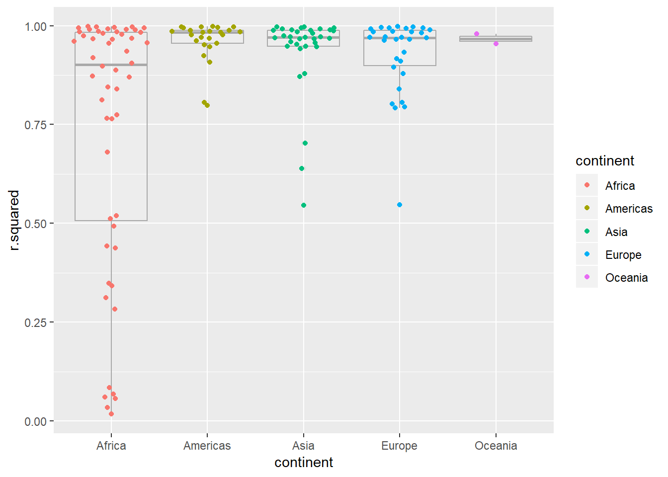
- I like
geom_quasirandom()the best as an overlay on boxplot, it keeps things centered and doesn’t have the gravitational pull affect that makesgeom_beeswarm()become a little misaligned, it also works well here overgeom_jitter()as the points stay better around their true value
- I like
To create the last plot (showing the data for the countries with the worst model fits), we needed two steps: we created a data frame with one row per country and then semi-joined it to the original dataset. It’s possible to avoid this join if we use
unnest()instead ofunnest(.drop = TRUE). How?#first filter by r.squared and then unnest by_country3_quad %>% mutate(data_preds = purrr::map2(data_cent, mod_quad, add_predictions)) %>% unnest(glance_mod) %>% mutate(bad_fit = r.squared < 0.25) %>% filter(bad_fit) %>% unnest(data_preds) %>% ggplot(aes(x = year, group = country))+ geom_point(aes(y = lifeExp, colour = country))+ geom_line(aes(y = pred, colour = country))+ facet_wrap(~country)+ theme(axis.text.x = element_text(angle = 90, hjust = 1))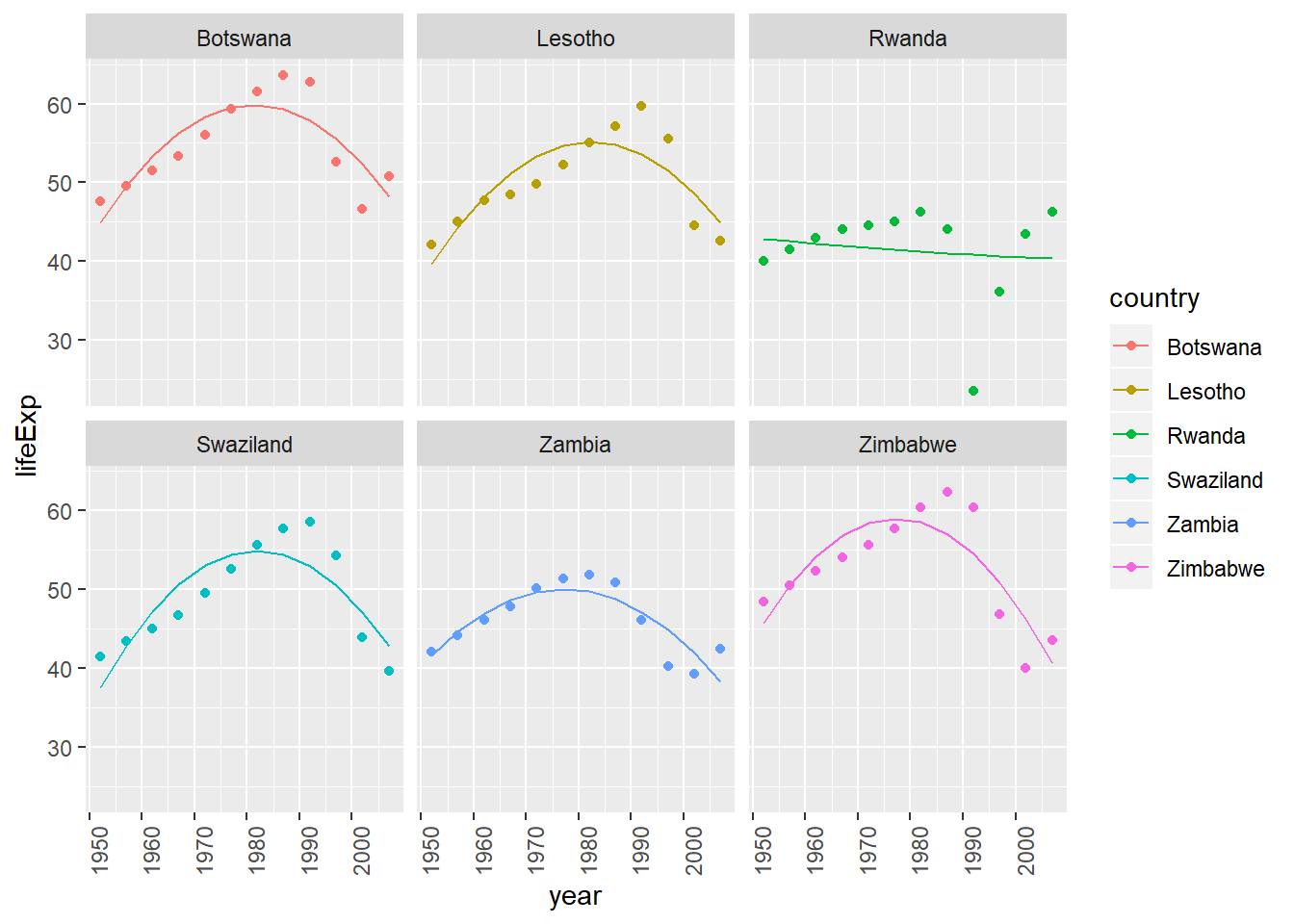
25.4: Creating list-columns
25.4.5
List all the functions that you can think of that take an atomic vector and return a list.
stringr::str_extract_all+ otherstringrfunctions
(however the below can also take types that are not atomic and are probably not really what is being looked for)
listtibblemap/lapply
Brainstorm useful summary functions that, like
quantile(), return multiple values.summaryrange- …
What’s missing in the following data frame? How does
quantile()return that missing piece? Why isn’t that helpful here?mtcars %>% group_by(cyl) %>% summarise(q = list(quantile(mpg))) %>% unnest()## # A tibble: 15 x 2 ## cyl q ## <dbl> <dbl> ## 1 4 21.4 ## 2 4 22.8 ## 3 4 26 ## 4 4 30.4 ## 5 4 33.9 ## 6 6 17.8 ## 7 6 18.6 ## 8 6 19.7 ## 9 6 21 ## 10 6 21.4 ## 11 8 10.4 ## 12 8 14.4 ## 13 8 15.2 ## 14 8 16.2 ## 15 8 19.2- need to capture probabilities of quantiles to make useful…
probs <- c(0.01, 0.25, 0.5, 0.75, 0.99)

mtcars %>%
  group_by(cyl) %>%
  summarise(p = list(probs), q = list(quantile(mpg, probs))) %>%
  unnest()
## # A tibble: 15 x 3 ## cyl p q ## <dbl> <dbl> <dbl> ## 1 4 0.01 21.4 ## 2 4 0.25 22.8 ## 3 4 0.5 26 ## 4 4 0.75 30.4 ## 5 4 0.99 33.8 ## 6 6 0.01 17.8 ## 7 6 0.25 18.6 ## 8 6 0.5 19.7 ## 9 6 0.75 21 ## 10 6 0.99 21.4 ## 11 8 0.01 10.4 ## 12 8 0.25 14.4 ## 13 8 0.5 15.2 ## 14 8 0.75 16.2 ## 15 8 0.99 19.1- see list(quantile()) examples for related method that captures names of quantiles (rather than requiring th user to manually input a vector of probabilities)
What does this code do? Why might it be useful?
mtcars %>% select(1:3) %>% group_by(cyl) %>% summarise_all(funs(list))- It turns each row into an atomic vector grouped by the particular
cylvalue. It is different fromnestin that each column creates a new list-column representing an atomic vector. Ifnesthad been used, this would have created a single dataframe that all the values woudl have been in. Could be useful for running purr through particular columns… - e.g. let’s say we want to find the number of unique items in each column for each grouping, we could do that like so
mtcars %>%
  group_by(cyl) %>%
  select(1:5) %>%
  summarise_all(funs(list)) %>%
  mutate_all(funs(unique = map_int(., ~length(unique(.x)))))
## Warning: funs() is soft deprecated as of dplyr 0.8.0 ## please use list() instead ## ## # Before: ## funs(name = f(.) ## ## # After: ## list(name = ~f(.)) ## This warning is displayed once per session.## # A tibble: 3 x 10 ## cyl mpg disp hp drat cyl_unique mpg_unique disp_unique hp_unique ## <dbl> <lis> <lis> <lis> <lis> <int> <int> <int> <int> ## 1 4 <dbl~ <dbl~ <dbl~ <dbl~ 1 9 11 10 ## 2 6 <dbl~ <dbl~ <dbl~ <dbl~ 1 6 5 4 ## 3 8 <dbl~ <dbl~ <dbl~ <dbl~ 1 12 11 9 ## # ... with 1 more variable: drat_unique <int># we could also simply overwrite the values (rather than make new columns) mtcars %>% group_by(cyl) %>% select(1:5) %>% summarise_all(funs(list)) %>% mutate_all(funs(map_int(., ~length(unique(.x)))))## # A tibble: 3 x 5 ## cyl mpg disp hp drat ## <int> <int> <int> <int> <int> ## 1 1 9 11 10 10 ## 2 1 6 5 4 5 ## 3 1 12 11 9 11- It turns each row into an atomic vector grouped by the particular
25.5: Simplifying list-columns
25.5.3
Why might the
lengths()function be useful for creating atomic vector columns from list-columns?- perhaps you want to measure the number of elements (or unique elements) in an individual element of a list column
mpg %>%
  group_by(cyl) %>%
  summarise(displ_list = list(displ)) %>%
  mutate(num_unique = map_int(displ_list, ~unique(.x) %>% length()))
## # A tibble: 4 x 3
## cyl displ_list num_unique
## <int> <list> <int>
## 1 4 <dbl [81]> 8
## 2 5 <dbl [4]> 1
## 3 6 <dbl [79]> 14
## 4 8 <dbl [70]> 17List the most common types of vector found in a data frame. What makes lists different?
- the atomic types: char, int, double, factor, date are all more common, they are atomic, whereas lists are not atomic vectors and can contain any type of data within them (e.g. a list of atomic vectors, list of lists, etc.).
Appendix
Models in lists
This is the more traditional way you might store models in a list
models_countries <- purrr::map(by_country$data, country_model)

names(models_countries) <- by_country$country

models_countries[1:3]
## $Afghanistan
##
## Call:
## lm(formula = lifeExp ~ year, data = df)
##
## Coefficients:
## (Intercept) year
## -507.5343 0.2753
##
##
## $Albania
##
## Call:
## lm(formula = lifeExp ~ year, data = df)
##
## Coefficients:
## (Intercept) year
## -594.0725 0.3347
##
##
## $Algeria
##
## Call:
## lm(formula = lifeExp ~ year, data = df)
##
## Coefficients:
## (Intercept) year
## -1067.8590 0.5693List-columns for sampling
say you want to sample all the flights on 50 days out of the year. List-cols can be used to generate a sample like this:
flights %>%
  mutate(create_date = make_date(year, month, day)) %>%
  select(create_date, 5:8) %>%
  group_by(create_date) %>%
  nest() %>%
  sample_n(50) %>%
  unnest()
## # A tibble: 45,640 x 5
## create_date sched_dep_time dep_delay arr_time sched_arr_time
## <date> <int> <dbl> <int> <int>
## 1 2013-02-09 900 1 1242 1227
## 2 2013-02-09 1130 30 1434 1430
## 3 2013-02-09 900 186 1814 1540
## 4 2013-02-09 1220 2 1545 1532
## 5 2013-02-09 1240 -3 1414 1444
## 6 2013-02-09 1245 -5 1528 1600
## 7 2013-02-09 1250 0 1526 1550
## 8 2013-02-09 1259 -4 1535 1555
## 9 2013-02-09 1300 -2 1540 1605
## 10 2013-02-09 1300 3 1626 1608
## # ... with 45,630 more rowsAlternatively you could use a semi_join(), e.g.
flights_samp <- flights %>%
  mutate(create_date = make_date(year, month, day)) %>%
  distinct(create_date) %>%
  sample_n(50)

flights %>%
  mutate(create_date = make_date(year, month, day)) %>%
  select(create_date, 5:8) %>%
  semi_join(flights_samp, by = "create_date")
## # A tibble: 46,640 x 5
## create_date sched_dep_time dep_delay arr_time sched_arr_time
## <date> <int> <dbl> <int> <int>
## 1 2013-01-15 500 -7 645 648
## 2 2013-01-15 525 -7 825 820
## 3 2013-01-15 530 3 839 831
## 4 2013-01-15 540 -6 829 850
## 5 2013-01-15 540 -5 1014 1017
## 6 2013-01-15 600 -17 710 715
## 7 2013-01-15 600 -11 637 709
## 8 2013-01-15 600 -8 934 910
## 9 2013-01-15 600 -8 658 658
## 10 2013-01-15 600 -7 851 859
## # ... with 46,630 more rows- In some situations I find the
nest,unnestmethod more elegant though thesemi_joinmethod seems to run goes faster on large dataframes - There are also other more specialized functions in the tidyverse to help with various sampling strategies
25.2.5.1
Include cubic term
Let’s look at this example if we had allowed year to be a 3rd order polynomial. We’re really stretching our degrees of freedom (in relation to our number of observations) in this case – these might be less likely to generalize to other data well.
by_country3 %>%
  semi_join(bad_fit, by = "country") %>%
  mutate(
    # create centered data
    data_cent = purrr::map(data, center_value),
    # create cubic (3rd order) data
    mod_cubic = purrr::map(data_cent, lm_quad_2, var = "year_cent + I(year_cent^2) + I(year_cent^3)"),
    # get predictions for 3rd order model
    data_cubic = purrr::map2(data_cent, mod_cubic, add_predictions)) %>%
  unnest(data_cubic) %>%
  ggplot(aes(x = year, group = country))+
  geom_point(aes(y = lifeExp, colour = country))+
  geom_line(aes(y = pred, colour = country))+
  facet_wrap(~country)+
  theme(axis.text.x = element_text(angle = 90, hjust = 1))
- interpretibility of coefficients beyond quadratic term becomes less strait forward to explain
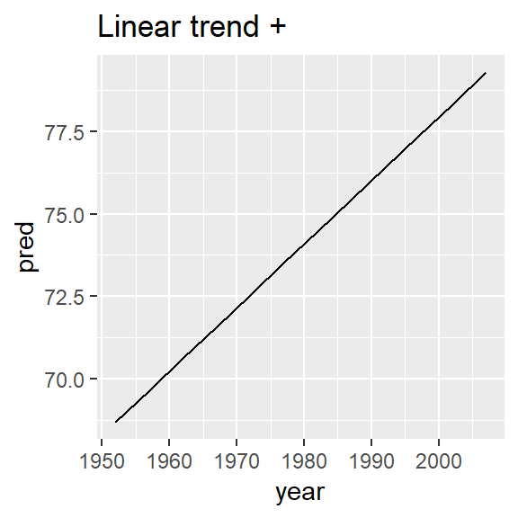
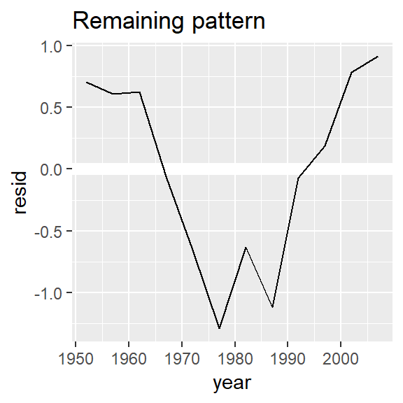
Multiple graphs in chunk
There are a variety of ways to have multiple graphs outputted and aligned side by side:
- build graphs separately and use
gridExtra::grid.arrange() - Ensure metrics have been gathered into a single column and then use
facet_wrap()/facet_grid()(ggforceis a helpful extension package to ggplot2 that gives more functionality to these faceting functions) - manipulate chunk options, e.g. figures below have the following options set in the R code chunk:
out.width = "33%", fig.asp = 1, fig.width = 3, fig.show='hold',, fig.align='default'
nz <- filter(gapminder, country == "New Zealand")
nz %>%
  ggplot(aes(year, lifeExp)) +
  geom_line() +
  ggtitle("Full data = ")

nz_mod <- lm(lifeExp ~ year, data = nz)
nz %>%
  add_predictions(nz_mod) %>%
  ggplot(aes(year, pred)) +
  geom_line() +
  ggtitle("Linear trend + ")

nz %>%
  add_residuals(nz_mod) %>%
  ggplot(aes(year, resid)) +
  geom_hline(yintercept = 0, colour = "white", size = 3) +
  geom_line() +
  ggtitle("Remaining pattern")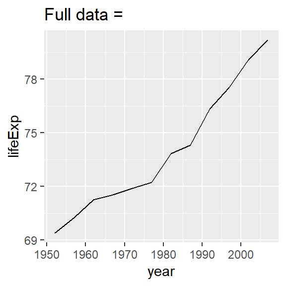
list(quantile()) examples
Some of these examples may not represent best practices.
prob_vals <- c(0, .25, .5, .75, 1)
iris %>%
  group_by(Species) %>%
  summarise(Petal.Length_q = list(quantile(Petal.Length))) %>%
  mutate(probs = list(prob_vals)) %>%
  unnest()
## # A tibble: 15 x 3
## Species Petal.Length_q probs
## <fct> <dbl> <dbl>
## 1 setosa 1 0
## 2 setosa 1.4 0.25
## 3 setosa 1.5 0.5
## 4 setosa 1.58 0.75
## 5 setosa 1.9 1
## 6 versicolor 3 0
## 7 versicolor 4 0.25
## 8 versicolor 4.35 0.5
## 9 versicolor 4.6 0.75
## 10 versicolor 5.1 1
## 11 virginica 4.5 0
## 12 virginica 5.1 0.25
## 13 virginica 5.55 0.5
## 14 virginica 5.88 0.75
## 15 virginica 6.9 1Example for using quantile across range of columns
Also notice dynamic method for extracting names
iris %>%
  group_by(Species) %>%
  summarise_all(funs(list(quantile(., probs = prob_vals)))) %>%
  mutate(probs = map(Petal.Length, names)) %>%
  unnest()
## # A tibble: 15 x 6
## Species Sepal.Length Sepal.Width Petal.Length Petal.Width probs
## <fct> <dbl> <dbl> <dbl> <dbl> <chr>
## 1 setosa 4.3 2.3 1 0.1 0%
## 2 setosa 4.8 3.2 1.4 0.2 25%
## 3 setosa 5 3.4 1.5 0.2 50%
## 4 setosa 5.2 3.68 1.58 0.3 75%
## 5 setosa 5.8 4.4 1.9 0.6 100%
## 6 versicolor 4.9 2 3 1 0%
## 7 versicolor 5.6 2.52 4 1.2 25%
## 8 versicolor 5.9 2.8 4.35 1.3 50%
## 9 versicolor 6.3 3 4.6 1.5 75%
## 10 versicolor 7 3.4 5.1 1.8 100%
## 11 virginica 4.9 2.2 4.5 1.4 0%
## 12 virginica 6.22 2.8 5.1 1.8 25%
## 13 virginica 6.5 3 5.55 2 50%
## 14 virginica 6.9 3.18 5.88 2.3 75%
## 15 virginica 7.9 3.8 6.9 2.5 100%Extracting names
Maybe not best practice:
quantile(1:100) %>%
  as.data.frame() %>%
  rownames_to_column()
## rowname .
## 1 0% 1.00
## 2 25% 25.75
## 3 50% 50.50
## 4 75% 75.25
## 5 100% 100.00Better would be to use enframe() here:
quantile(1:100) %>%
  tibble::enframe()
## # A tibble: 5 x 2
## name value
## <chr> <dbl>
## 1 0% 1
## 2 25% 25.8
## 3 50% 50.5
## 4 75% 75.2
## 5 100% 100invoke_map example (book)
I liked Hadley’s example with invoke_map and wanted to save it:
sim <- tribble(
  ~f,      ~params,
  "runif", list(min = -1, max = -1),
  "rnorm", list(sd = 5),
  "rpois", list(lambda = 10)
)

sim %>%
  mutate(sims = invoke_map(f, params, n = 10))
## # A tibble: 3 x 3
## f params sims
## <chr> <list> <list>
## 1 runif <list [2]> <dbl [10]>
## 2 rnorm <list [1]> <dbl [10]>
## 3 rpois <list [1]> <int [10]>named list example (book)
I liked Hadley’s example where you have a list of named vectors that you need to iterate over both the values as well as the names and the use of enframe to facilitate this.
Below is the copied example and notes:
x <- list(
  a = 1:5,
  b = 3:4,
  c = 5:6
)

df <- enframe(x)
df
## # A tibble: 3 x 2
## name value
## <chr> <list>
## 1 a <int [5]>
## 2 b <int [2]>
## 3 c <int [2]>The advantage of this structure is that it generalises in a straightforward way - names are useful if you have character vector of metadata, but don’t help if you have other types of data, or multiple vectors.
Now if you want to iterate over names and values in parallel, you can use map2():
df %>%
  mutate(
    smry = map2_chr(name, value, ~ stringr::str_c(.x, ": ", .y[1]))
  )
## # A tibble: 3 x 3
## name value smry
## <chr> <list> <chr>
## 1 a <int [5]> a: 1
## 2 b <int [2]> b: 3
## 3 c <int [2]> c: 5Make sure the following packages are installed:
Note that if using
.drop = FALSEin the latter case that you are creating replicated rows for list-col values↩